Daily Infections
Daily Infections
COVID-19
An analysis of a pandemic
Powered by Logecal Data Analytics
Disclaimer: Any information provided this website may be inaccurate. You agree that by reading the information provided on this website, you will not hold the authors of these analyses, nor the publisher of this website responsible or liable for any adverse outcome resulting from your use of this information. You agree that the information on this website is provided to “use at your own risk.”
Updated on:
4/24/2024

The math
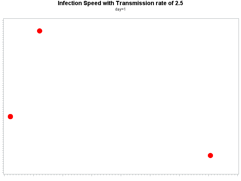
The speed in which an unmitigated infection spreads in communities is measured by the number of person-to-person transmissions that occur from each infected person, i.e., how many persons each infected individual will transmit the virus to. In epidemiology, this number is termed as the reproductive rate and is represented by R0 (pronounced as R-naught or R-zero). The higher the number, the greater the speed of the epidemic. To illustrate the importance of this number, consider an epidemic whose R0 is 2. (left graph), as compared to an epidemic whose R0 is 1 (right graph). With R0=2, the first infected person will transmit the virus to 2 other persons, each of these 2 people will go on to transmit the virus to 2 other individuals, and so on.
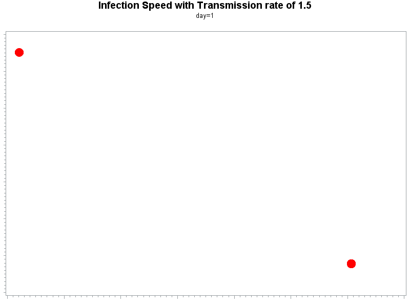
This will go on for a while, and it is readily obvious that in the case of R0=2, the rise in cases is exponential in the early stage of the pandemic. R0 evolves over time due to various factors (weather, vaccination, social distancing, etc.) and eventually will go down as measures to control the spread are implemented. The higher the initial R0, the higher the speed of infection in communities in the early phase of an epidemic. Covid-19 is thought to have an R0 of about 2.5. For comparison, the H1N1 swine flu virus had an R0 of 1.4-1.6.
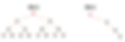
On the right are two animations showing a spread of an infection like Covid-19 with an R0 of 2.5 (top) vs. an H1N1-like infection with an R0 of 1.5 (bottom). The difference between the 2 cases is eye-opening: with only 1 more person-to-person infection, within a few days, an entire community of 1000 people will be infected with an R0 of 2.5, while much fewer individuals will be infected with an R0 of 1.5.
To contain an epidemic, R0 must be brought down to less than 1. This can be done by various methods, including physical separation (social distancing), sanitation, etc. Communities that practice these control methods can reduce the speed of the epidemic as was proven in various countries, such as China and South Korea.
How is R0 related to the daily infection rate?
When R0 is 1, meaning, on average, each person transmits the virus to 1 other individual, the number of new daily infections will become constant. This will cause the total number of infections to rise linearly rather than exponentially. A sign that the spread of the epidemic is slowing is the straightening of the curve of the number of new daily infections, and further, turning it from having a convex (upward) to a concave (downward) curvature. The time at which this occurs is the inflection point.
What you see is Not what you get
The number of new daily infections is most likely inaccurate. There are several reasons for that, most notably, it reflects only those who were tested because they may have passed the criteria required for testing. In the USA, testing has been increasing over time, and the rise in the daily infections may reflect the increased testing. One other major reason for the inaccuracy is the lag between the time of the transmission occurred and the time result of testing has come back positive. These suggest that in the early phase of an epidemic, the number of new daily infections is markedly under-estimating the true rate, especially with an epidemic that has a fairly high R0 such as Covid-19. On the other hand, when the rate of infections is slowing down, the number of new daily infections tends to over-estimate the true rate. This suggests that when an inflection point is observed, inflection may already have occurred.


R0=2.5
R0=1.5


The inflection point and future projections
We estimate the number of new daily infections by a statistical model that eliminates the variability in the reported numbers .We then estimate slopes of the curve using statistical regression on groups of 5 daily points at a time. We compare these slopes sequentially until several successive slopes show a reduction trend. Once an inflection point has been identified, a statistical model is devised which projects the number of new daily infections, incorporating the day-to-day variability.
How to interpret the graphs
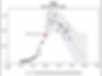
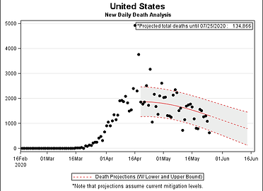
The black dots represent the number of new COVID19 cases per day. We plot them as they are reported.
The blue line takes into account the day-to-day variability and provides a smooth representation of the data over time.
The inflection point, noted as a red dot, indicates a change in the pattern. It is NOT the point at which the number of new cases immediately starts to decline. Instead, it shows the point where the exponentially increasing number of cases starts to slow down. The total number of cases is still rising, but not as dramatically. It suggests that we can expect the number of new cases to begin to decline soon. Plots without an inflection point mean that one has not yet occurred for that particular geographic region.
The blue solid line represents our projections for the future. The blue dotted lines bound our projection with upper and lower limits of what the predictions might actually be, i.e. the future number of cases will likely fall within the gray shaded area.